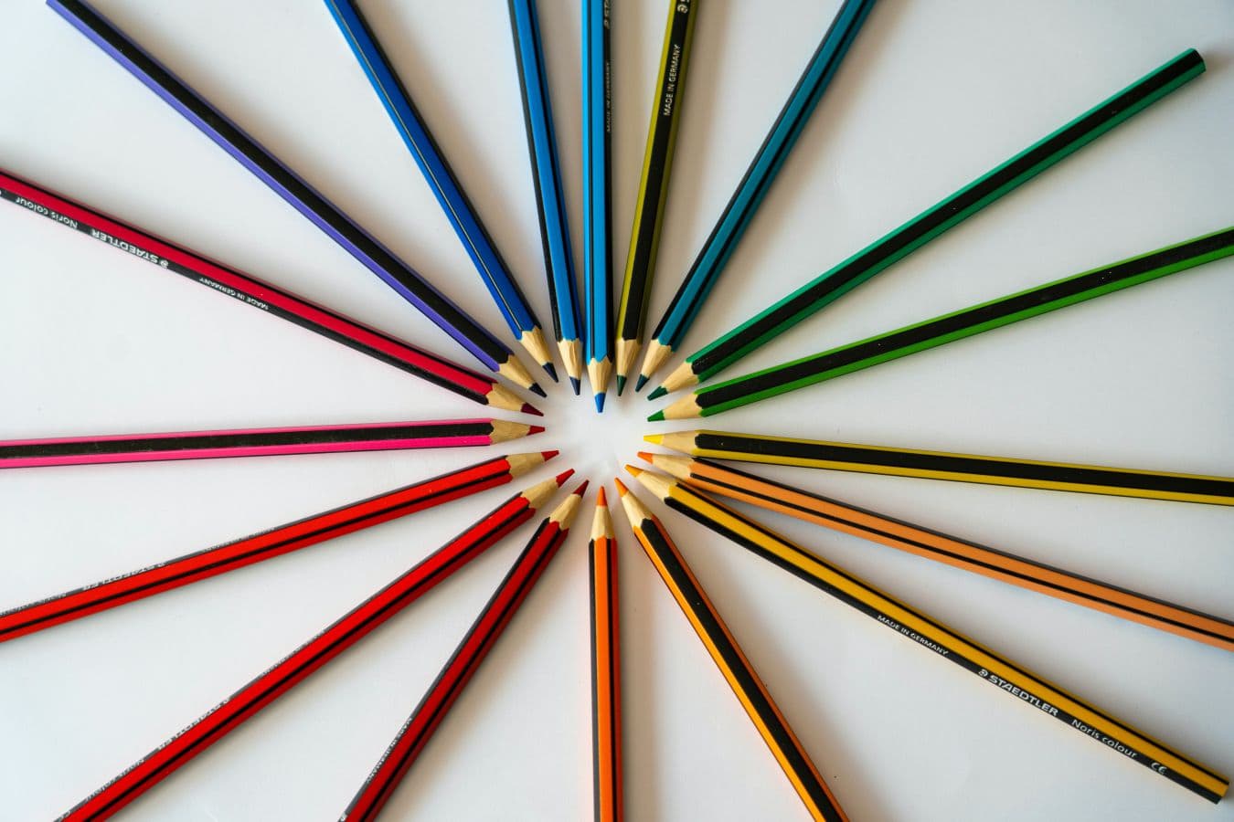
Put simply, colour has an impact on our emotions, and our emotions have an impact on our decisions. The decisions we make are essentially the building blocks that work together to shape our lives. So, I guess you could say that having a good understanding of colour is important. In this article we’ll uncover the importance of colour and how it plays a role in almost every aspect of our life.
Often, we don’t necessarily find ourselves noticing the importance of colour in our day to day lives. We may notice it when shopping for clothes, or when waiting at a traffic light, but over than that, we don’t tend to read too deeply into colours. After reading this article however, I almost guarantee you’ll look at colours in a completely new light, or at least gain a deeper understanding of what we tend to ignore.

First, let’s take a look at the basics of colour theory.
Colours are separated into two main categories; ‘warm’ and ‘cool’. Black, white and grey are considered ‘neutrals’ which are added to colours to change their tint, shade or tone.
The Importance of Colour in Branding and Design
Colour and Emotion
The main reason why the use of colour is so important, is that there are emotions tied to the colours themselves. Warm colours typically include reds, oranges, yellows and similar combinations. Cool colours usually include blues, greens, and purples. Warm colours tend to convey feelings of warmth, passion, comfort or warning, whereas cool colours give off feelings of tranquility, calmness, peace and growth. However, these are rather generalized feelings. Take a look at the list below of the emotions associated with each individual colour.

Red: passion, love, energy, immediacy
Orange: health, wealth, change, warning
Yellow: happiness, warmth, optimism, cheer
Green: balance, heath, environment, harmony, wealth
Blue: calmness, trust, faith, wisdom, integrity, serenity
Purple: luxury, royalty, creativity, mystery, wealth
Pink: romance, playfulness, sensitivity, care, love
White: purity, simplicity, cleanliness, innocence, hope
Black: professionalism, formality, death, power, mystery
All Trademarks referred to are the property of their respective owners.
Research studies on the impact of colour
Studies on colour and its impact on our mood have demonstrated a vast number of examples that work to support colour theory.
As you read earlier, blue induces feelings of calmness, serenity and integrity. A study conducted in the early 2000s showed the impact of changing the colour of yellow street lights to blue. Although blue light is commonly known to relieve stress, the results of the study exceeded this expectation.
The study showed a significant decrease in crimes committed in streets that had blue street lights. In a similar study, blue lights were installed at train stations, after which the number of suicides that usually occurred there also decreased considerably. Since the blue lights were installed, no suicides have been reported in years.

Although this is a rather weighty example in which our use of colour is important, there are a number of more subtle ways in which colour is featured in our daily lives.
Colour theory in our daily lives
Warmer colours are used to make for a warmer, socially inviting environment, whereas cooler tones make for a more calming, cleanly environment.
Can you think of any places where these tones may be suitably used? Hospitals usually use cool colours for both their décor, floor and wall paint. Warmer tones are usually seen in living rooms, sitting rooms or restaurants. Taking a look back at the feelings that these colours induce, you can see why they’re used in these places.
Now that you have a greater understanding of the powerful impact that colour can have, let’s take a look at its importance in branding and the design world.
Colour in Branding, Design & Culture
Brands tend to pick specific colours for their logos and related branding, marketing etc. based on their target market and the experience they promise to provide. For example, Cadbury uses purple to convey to their consumers that they are a luxury chocolate. Barbie’s branding is bright pink, aligning with their target market that is stereotypically young girls.

Children are inherently attracted to bright colours, and girls are usually attracted to pink. This brings us to another point – colour is also linked to gender. Boys are predominantly dressed in blue and girls in pink. Nowadays parents are straying from these stereotypes however they still exist in society as dominant symbols.
The Psychology of colour in design
Colours work to set the tone of a brand or a feeling of a product. It’s important to take all of these factors into consideration when branding your business, as it plays a bigger role than you may think. Essentially, there is a deep psychological process that occurs when we see colour, that will undoubtedly have an impact on customers perception of your brand as well as their inclination to purchase a product.

If a brand uses colours that are unappealing to their target audience, it’s likely that their customers will lose interest very fast. Studies have shown that it takes a maximum of 90 seconds for a customer to determine their opinion of a given brand.
A brands use of colour palettes as well as the related symbols or imagery all work to determine a customer’s opinion. Essentially, it is the customers opinion that establishes a brand success. A brands choice of aesthetics correlates to both its identity and its personality, which customers can then (hopefully) relate to.
Factors to consider when choosing colour palettes
With all this in mind, make sure you don’t select colours for anything on a whim, ensure that you have a clear intention behind your choices and a strong message you aim to convey. Also check in on the latest colour trends, which are usually set by Pantone and filtered through various industries.
Having a clear understanding of all of these factors, considering the positives and negatives of being associated with specific colours and knowing the ins and outs of your particular industry is crucial for branding your site, product or company. Be sure to also have the same considerations for less critical tasks such as deciding on a colour palette for your new living room.

Make sure you also read our other articles regarding colours in design
We have also written an interesting article about the Colour Theory in Design. Colour theory can be regarded as a set of guidelines and rules that artists, designers and creatives generally use to aid in portraying their message, idea or concept. So if you are ready to learn more about Primary, Secondary and Tertiary Colours, make sure to read this article about colour theory.
We have also checked out the 3 best colour palette generators that will help you pick the perfect colour combinations for your next project.


0 Comments