Although creativity and design is subjective to a certain degree, there are a number of fundamental rules that should generally be followed. These rules (we call them The 7 Principles of Design) are put in place to ensure that your design achieves its basic purpose – to attract attention and do so effectively. Aesthetic appreciation and conveying a particular message is essentially what design is all about.
So, in order to maximize your success in these domains, it’s important to understand what ‘good’ design guidelines are and why they are important. By failing to adhere to these principles, its likely your design might appear visually unpleasant or portray an incorrect message.
To improve your understanding of the principles of design, and help you create more successful designs, we’ve put together a guide that breaks down the 7 most important elements to note when creating a ‘good’ design.
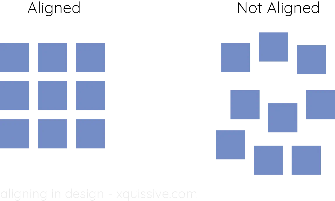
1. Alignment
There are a number of different elements that go into a completed design – font, colour, size, weight and icons to name a few. With this in mind, it’s important to remember the significance of aligning these elements effectively.
By placing the elements of your design in a haphazard way, you’re likely to create a design that appears unorganized and messy.
Composition wise, all elements should be balanced and aligned in relation to each other in a way that is both visually attractive and pleasing, as well as conveys your intended message or idea.
Whether your design is centred or off centre, weight can be used to create equilibrium. By failing to adhere to this guideline, you could be faced with a design that reflects negatively on your brand or business.

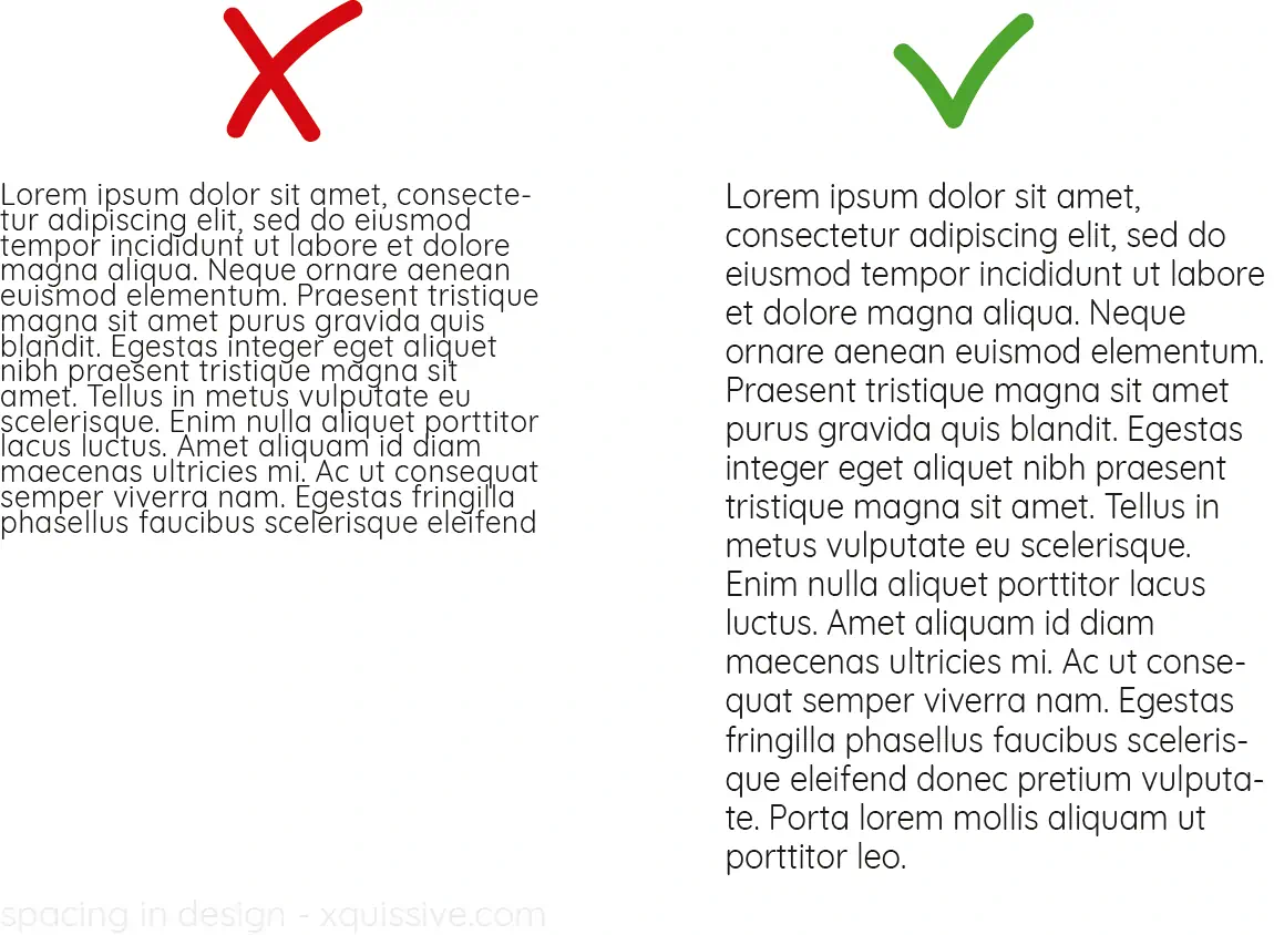
2. White Space
Attention to white space, or negative space is without a doubt one of the most important principles of design. This space can be defined as the space between the different elements of a design.
With the capability to make or break your design, white space is not necessarily always white, but can be any solid colour or texture. Free of any designs, elements or text, white space should be preserved but is often a debate amongst designers and clients.
The importance of this principle is that it allows for viewers to pause for a second and take in the key elements, however clients can often view this as lost space or a lack of design. Having enough white space adds an air of simplicity and professionalism to your design, so make sure to stick to this guideline when designing.

3. Contrast
Successfully using contrast in your design will allow you to guide the viewer through the design itself, creating a visual hierarchy. A visual hierarchy created by contrast indicates which elements are most important and which are less important.
It’s important to note that contrast doesn’t not mean conflict. Contrast is used to emphasize particular elements in an visually appealing manner, whereas conflict creates the opposite.
Contrast can be created using colour combinations or types. Naturally, bolder colours attract more attention whereas those of a lighter tone or hue may not. Make sure to pay attention to colour theory too, for example green and red are complementary colours that will ensure a strong contrast.
For more on this you can check out our article on colour theory in design. In regards to type, make sure you’re paying attention to weight and size, as well as only use 1 or 2 different typefaces.

4. Avoid Font Clashes
Font choice can either make or break a design, as it either draws attention to or distracts from the other elements within the design itself. It all really comes down to aesthetic alignment, with certain fonts suitable for headings and others for text. For example, cursive or similar elaborate fonts can be difficulty to read. For this reason, script fonts are generally not used for main text over 3 lines.
Aim to use a maximum of 2-3 fonts within your design, as more could be incredibly distracting. It’s also important that your choice of font aligns with your brand or business, as well as the industry. If you’re struggling to decide which font pairing best suits you, you can check out our article that covers some of our favourite font pairings.

5. Proportion
One of the most crucial aspects within design is scaling and proportion. When creating a design, it’s likely that it will be reproduced in a number of different ways and on a number of different mediums. With this in mind, it important that whether your design is scaled up or down, the proportions remain clear and consistent.
Images that are stretched look incredibly unprofessional and should be avoided at all costs. Luckily this is an issue that can easily be catered to – edit the specs of your design in Photoshop with the help of a professional so that no matter where it is uploaded, it is the right size, of a high quality and proportionate.
For print, you should use CMYK mode, whereas digital should be RGB mode. Aim for a resolution of at least 250 dpi when exporting to ensure that you maintain a high quality design.
6. Rule of 3
This simple yet impactful rule (also known as the Golden Ratio) is what separates a good designer from a GREAT designer. You may have heard of this rule or at least seen it before. It’s most popular appearance is seen on the grid setting on the iPhone camera. This tool is in fact much more handy that you think!
Essentially, the grid layout divides a field into 3 horizontal segments and 3 vertical segments, creating 9 different fields. Interestingly, it’s not the 9 segments that are important, but the spots where the lines intersect. These spots on the grid are the prime focal areas that the eye is drawn to.

By placing elements in your design on these spots, the viewer’s attention to be draw to them as they stand out. In contrast, the empty spots in the middle of the 9 segments is likely to attract less attention. This rule of 3 brings both balance and symmetry to your design – crucial components in ‘good’ design.
7. Avoid Raster-based Files
Avoid raster-based images at all costs. Beginners in design can often use raster-based images unintentionally, but this mistake has impactful consequences. Raster-based images are notoriously prone to pixilation when their size is either increased or reduced. This problem however, has an easy fix!
Make sure to use large images with high resolutions in order to keep your design consistent no matter the size or scale. In regards to symbols, icons or other elements, stick to vector-based programs like Adobe illustrator. Vector graphics are relatively fool proof, so when it comes to quality you won’t be disappointed.
Learn more about design
If you’d like to know more about design, make sure to check out any of these books. They will give your more insight and teach you more about the general rules, but also how to break them in a positive way.
You can also follow the course Graphic Design Fundamentals: The Complete Set by Timothy Samara Which is a bundle of 5 classes that cover each and every aspect of graphic design. It includes the following classes: Graphic Design Fundamentals: Getting Started, Color, Form and Image, Layout and Typography.


0 Comments