Whether they were released on vinyl, CD or digitally, album covers play a crucial role in determining the reach and success of music albums. Over the years we have witnessed artists tap into their creative side, putting out album covers that incorporate a number of design techniques, tools and elements.
Photography, 3D rendering, sketches and paintings have all been seen over the years on the covers of iconic album releases – and we’re here to curate a list showcasing the best of the best. From the 1960s, all the way to the 2020s, we’re going to be breaking down our favourite album cover designs of all time.
We’ll touch on the inspiration behind the design, the creative process, and the team behind the final designs. Make sure to take note of the different design tools, aesthetics and trends that have been used to create these great album covers.
The following albums are placed in no particular order.
Best Music Album Cover Designs of All Time
When We All Fall Asleep, Where Do We Go? – Billie Eilish

The cover of Billie Eilish’s renowned album When We All Fall Asleep, Where Do We Go? was released in March of 2019 and was shot by veteran photographer Kenneth Cappello. The photographer himself had worked with Eilish before on her previous EP released in 2017, Don’t Smile at Me.
The inspiration behind the cover design stemmed from Billie Eilish’s interest in the theme of horror, night terrors, lucid dreaming and the popular horror film The Babadook. Billie noted that she wanted a cover that was moody, emotional and most importantly, conveyed transparency and a sense of realness.
The shoot lasted around 12 hours and took place on Billie’s birthday at a studio in Los Angeles, California. Known for her close involvement in all creative aspects of her career, Billie had prepared sketches with a strong point of view that she wanted the shoot to be based upon.
Yeezus – Kanye West

Yeezus by Kanye West was released in June of 2013 and the cover design itself stirred up quite the controversy. Known for this abstract yet iconic creative design approach, Kanye set out for a design that was both minimalistic and symbolic.
Known fashion designer and fellow creative Virgil Abloh, who worked as the assistant creative director at West’s creative content company DONDA, worked together with Kanye, Matthew Williams and Justin Saunders to produce the final album cover design.
The inspiration behind the album was based on both Kanye’s request for a music-focused cover and an idea put together with Abloh. He explained how the simple album design was much more complex, and that the simple CD in a clear case with red tape was symbolic of the death of the CD. Paying homage to an era of music, Abloh noted that it was “an open casket for a format of music we were raised off of that’ll never be seen.”
Abbey Road – The Beatles
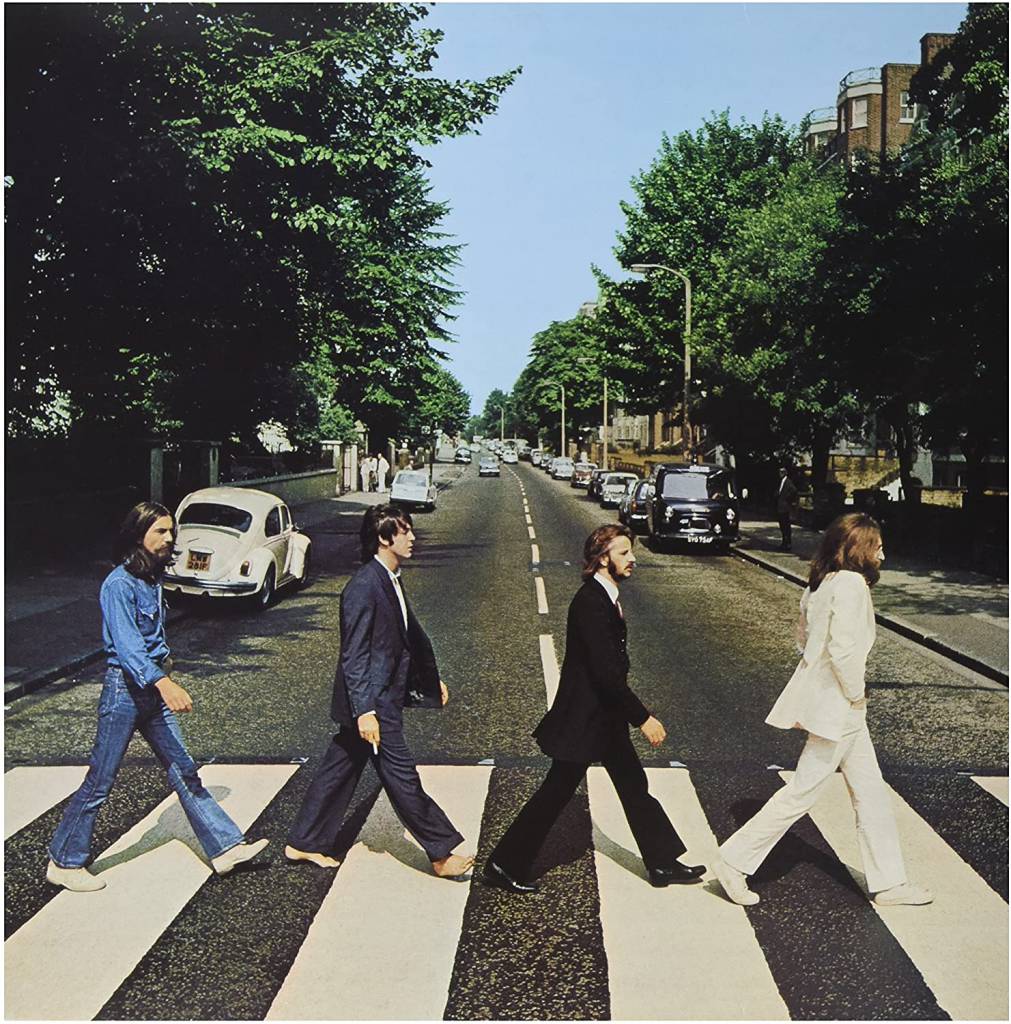
The renowned Abbey Road cover is maybe one of the most widely known images in history.
The album cover design was captured by photographer Iain Macmillan and features the members of The Beatles – George Harrison, Paul McCartney, Ringo Starr and John Lennon crossing a zebra crossing on Abbey road on August 8th of 1969.
The four were leaving EMI studios in London where they had just finished recording their album and coincidentally spent most of their time during their career.
The cover design itself has stirred up a great deal of talk regarding striking details featured in the photograph – namely, Paul McCartney not wearing shoes and the cryptic licence late among others.
Aladdin Sane – David Bowie (1973)
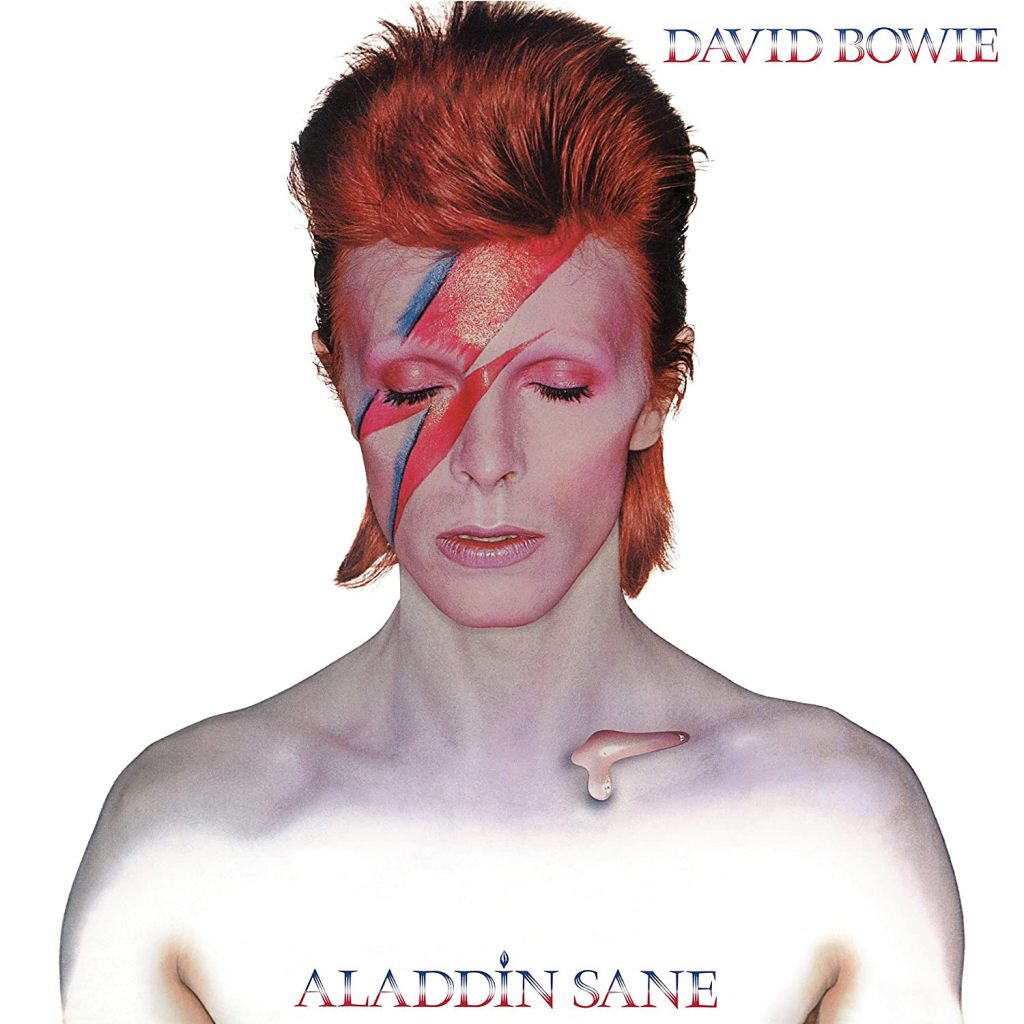
Aladdin Sane by David Bowie was released in April of 1973 and captured by photographer Brian Duffy in his studio in London. The name of the album itself is play on ‘A Lad Insane’, a theme that seems to reflect in the album cover design too.
The photograph features Bowie shirtless with red hair and the iconic red and blue lightning bolt across his face. The entire cover shoot process was recorded as the most expensive cover art ever made at that time, with the photographer requesting a 7 colour system rather than the standard 4.
Bowie’s inspiration behind the lightning flash stemmed from a ring that he claimed Elvis Presley had worn, which he then aligned with a slitting of one’s personality or feelings. It was then determined that the split that Bowie was conveying was his mixed feelings surrounding his fame and touring.
Undoubtedly the most iconic image of David Bowie’s career, Mick McCann at The Guardian noted that it was “the Mona Lisa of album covers” and transcended stereotypical expectations of that time.
Demon Days – Gorillaz (2005)
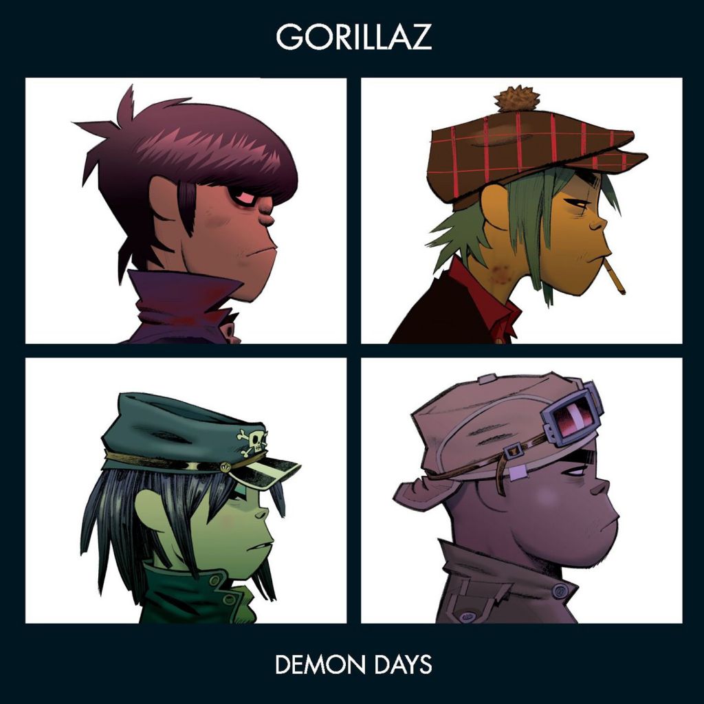
Released on May 11th of 2005, Demon Days by Gorillaz fashions a cover that is known around the world. The album cover design features four of the virtual band members – 2D, Noodle, Murdoc Niccals and Russel Hobbs.
At the height of their worldwide success, the band itself became a cultural symbol of the time. The album cover design itself was created by lead member of the band, Damon Albarn and known comic book artist James Hewlett.
Tile design is perhaps the leading design element of the cover – a feature used by prominent musicians like the Beatles, Kiss and Blur. The tile design highlights the distinction between the members, who are not only dressed in different clothes, but are of different races. This decision highlighted the diversity of the band as well as it’s inclusivity.
The fusion of purples, reds, oranges, greens and browns adds a sense of surrealism to the artwork – inspired by Damon Albarn’s travels in Beijing to Mongolia where he experienced the fusion of different environments and cultures. The virtual world that Gorillaz created symbolized the real world, in which the four members of the band are resemblant of young political activists.
Modus Vivendi – 070 Shake

Released by GOOD music and Def Jam in January of 2020, Modus Vivendi meaning way of life was released as the debut album of talented hip hop/indie artist 070 Shake. Well known illustrator Sam Spratt is back at it again, designing 070 Shake’s abstract album artwork for this release.
The obvious use of complementary colours is incredibly eye-catching. Paired with the highly detailed use of highlighting and shading, this piece appears resemblant of a photograph when viewed at a distance.
The abstract, sci-fi theme is also highly symbolic of 070 Shake’s alternative hip-hop music style and sets itself apart from the typical photographic or CGI approach to album cover designs.
LP1 – FKA Twigs
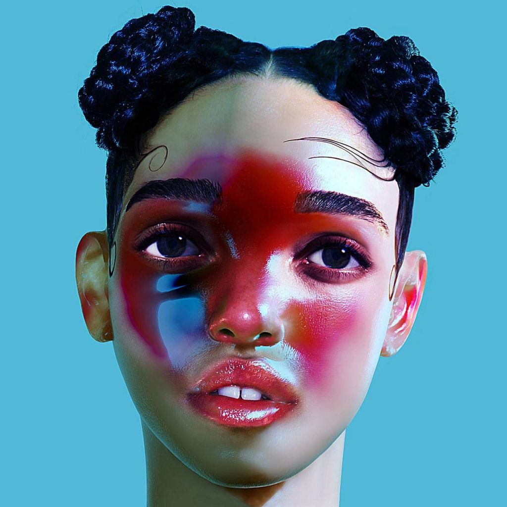
The striking design of FKA Twigs’ first studio album, released in August of 2014, set itself apart from others with its unique design approach. The cover itself was designed by Jesse Kanda (on imagery) and Phil Lee (on design).
At the time of its release, the album was a prominent feature in ‘best’ lists, especially in regards to creative direction and design. The incredibly eye catching digital manipulation of FKA Twigs’ own face showcased the endless abilities of Photoshop manipulation, creating an album cover design that incorporated elements of illustration, portrait, photography and sculpture.
Twigs’ abstract and disturbing yet alluring music style is perfectly paired with this album cover design of LP1.
Dark Side of the Moon – Pink Floyd
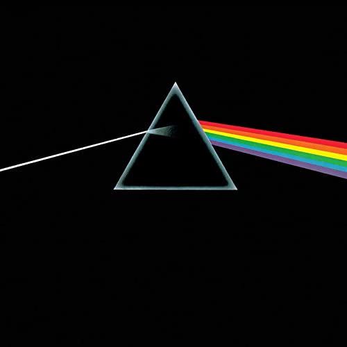
Perhaps one of the most recognisable album covers of all time, Pink Floyd’s Dark Side of the Moon released in 1973 was designed by Aubrey Powell and Storm Thorgerson from Hipgnosis.
The design itself came about late one night in a brainstorming session. The direction given to the designers was limitless, with suggestions to create something that is graphic, elegant and clean.
Thorgerson suggested an idea of a black and white photo with light dispersed by a prism. He had come across the idea in a physics book, which was instantly approved by the band as the official album cover design.
Holding a strong sense of symbolism, the triangle was said to symbolize thought and ambition and the light was representative of the band’s popular light shows.
Circles – Mac Miller

Released on January 17th of 2020, the photographer that created this incredibly beautiful posthumous album cover for Mac Miller’s album ‘Circles’ is still unknown.
Fans and critics have narrowed it down to either Mac Miller’s photographer before and around the time of his death, Justin Boyd or Christaan Felber, who was the last photographer to shoot with Mac before his death.
The album cover is composed of two photographs layered on top of each other in a way that resemble double exposure film photography. The cover itself is minimalist, but definitely has an underlying feeling of solemn. The choice of Miller’s team to utilize such a simplistic, heartfelt promotion represented the true meaning and vulnerability of the music itself.
Promotion of the album was incredibly lowkey and not too extravagant in order to demonstrate to the fans how important their support really was to Mac.
Grace Jones: Island Life (design by Jean-Paul Goude)
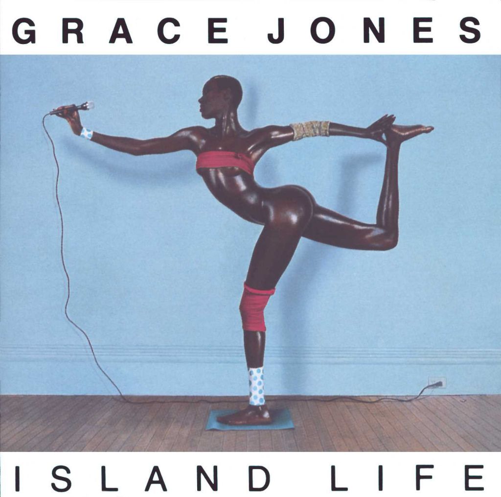
Released in December of 1985, Island Life by Grace Jones was designed in collaboration with her then lover and accomplice Jean-Paul Goude.
In an interview Jones described how Jean-Paul wanted to convey “this brutal, animalistic energy that was part disco, part theatre of cruelty, two lucid ways of representing an appetite for life. It was a visual description of an impossible, original beast, only possibly from this planet, a voracious she-centaur emerging from an unknown abyss and confronting people’s fears.”
The image itself features Grace, who was also a trained ballet dancer, poised in an almost possibly perfect position. The image portrays a sense of elegance, strength, perfection and an air of surrealism.
For a glimpse into the best album covers of 2020, check out our article where we break down 10 of the best cover designs that took the 2020 music industry by storm.


0 Comments